Designing Orokai: The Non-Custodial Tradeoffs Nobody Talks About
DAte
Category
Web3
Reading Time
5 Min

Non-custodial means the user holds the keys. It also means the interface can't quietly fix a mistake the way a custodial exchange can. There's no support ticket that reverses a signed transaction. Every design decision in a non-custodial app carries that constraint, whether the design team acknowledges it or not.
This is what building Orokai's app actually looked like from the engineering side: a series of decisions about what to show, what to hide, and what to force the user to see even when showing it hurts conversion.
The signing screen is the whole product
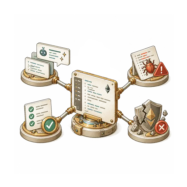
Most DeFi apps treat the wallet signature prompt as a formality between two "real" screens. It isn't. It's the one moment where the user is making an irreversible, cryptographically final decision, and it's usually rendered by the wallet, not the app, using whatever generic template the wallet ships with.
Orokai's flow front-loads the information that generic signature screens bury: what's being approved, for how much, and for how long. Token approvals in particular tend to request unlimited spending by default, because that's the path of least resistance for developers. Building the app meant defaulting to exact-amount approvals instead, and accepting the extra signature this sometimes requires. Fewer transactions per session, more security per transaction. That tradeoff isn't neutral. It costs a small amount of friction to buy a large amount of protection against approval-based exploits, one of the more common attack vectors in DeFi.
Cognitive load isn't the same problem as visual clutter
Simplifying a DeFi interface usually gets treated as a visual design problem: fewer buttons, cleaner layout, softer colors. That addresses surface complexity. It doesn't address the actual source of cognitive load in a non-custodial app, which is decision density. Slippage tolerance, gas estimation, network selection, approval scope: each one is a decision with real financial consequences, and each one the user has to actually understand, not just click through.
The design approach that worked wasn't hiding these decisions. It was sequencing them. Present one consequential decision at a time, with the specific number that decision produces, rather than a single dashboard where six financial variables compete for attention simultaneously. A user who sees "you'll receive at least 1,842 USDC" processes that faster and more accurately than one calculating it themselves from a slippage percentage buried in a settings menu.
Recovery without a seed phrase changes what the onboarding screen is for
The standard non-custodial answer to "what if the user loses access" is a twelve-word phrase, written down once, never shown again, with the entire account permanently gone if it's lost. Orokai doesn't use that model. Recovery runs through social recovery instead: a set of trusted guardians who can jointly restore access if a device is lost, with no phrase to write down and nothing centralized holding the keys on the user's behalf.
That changes what the onboarding screen actually has to accomplish. A seed phrase flow's whole job is getting the user to correctly transcribe and store twelve specific words. A social recovery flow's job is different: getting the user to choose guardians who will actually still be reachable and willing to act if recovery is ever needed. That's a judgment call about people, not a data-entry task, and it doesn't compress into a single confirmation screen the way a seed phrase check does.
The self-custody guarantee still holds. No third party can move funds unilaterally. What's gone is the specific failure mode where one lost or misplaced piece of paper means permanently lost funds with zero recourse, which was never a security feature so much as a security tradeoff the industry got used to defending as if it were one.
The interface can't apologize for the protocol
A recurring temptation in DeFi app design is to smooth over protocol-level complexity with reassuring copy: "don't worry, this is normal," "your funds are safe." That's a dark pattern dressed up as friendliness. It trains users not to read the thing they're being asked to sign.
The alternative, which is harder to design and slower to build, is making the actual mechanics legible instead of narrating comfort over them. If a transaction involves real risk, the interface's job is to make that risk visible and specific, not to pre-emptively soothe the user out of reading it. This connects to a broader shift the industry is only partway through: account abstraction and smarter wallet UX are starting to reduce how often users face raw signature prompts at all, but until that's the norm, [LINK: Account Abstraction: Making Crypto Usable for Normal Humans] the interface is the only thing standing between a user and a mistake they can't undo.
The full technical case study, including the specific implementation decisions and where the tradeoffs landed, is at [LINK: Base58 Work: Orokai].
Meta description: How Base58 designed Orokai's non-custodial app: signing flows, token approval defaults, social recovery onboarding, and where security and UX directly conflict.
Conclusion
Designing a non-custodial product means accepting that some friction is doing useful work. The goal isn't to make irreversible decisions feel invisible; it's to make them understandable before the user commits to them. Orokai's design choices — exact approvals, sequenced decisions, social recovery, and explicit risk communication — all follow the same principle: better UX in self-custody comes from making consequences clearer, not pretending they aren't there.

Dariusz Wróbel
CEO